Label Design Brief
Year: 2021 Under Employment: Freelance Deliverables: Wine Label System
Challenge
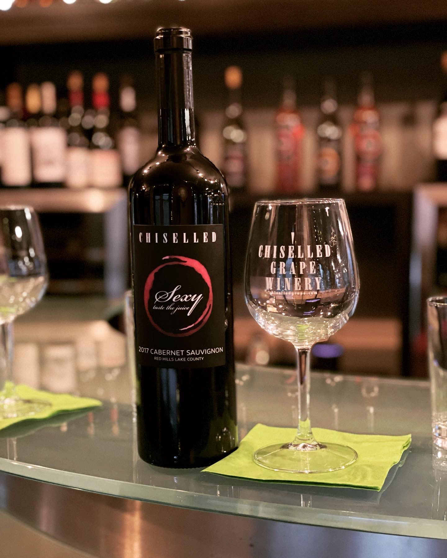
Chiselled Grape approached me to refresh the label for its signature wine line, Sexy. The existing labels relied on clip art and failed to capture the bold, sophisticated personality suggested by the product name. The challenge was to create a more distinctive, premium design that aligned the packaging with the brand's intended identity.
my role
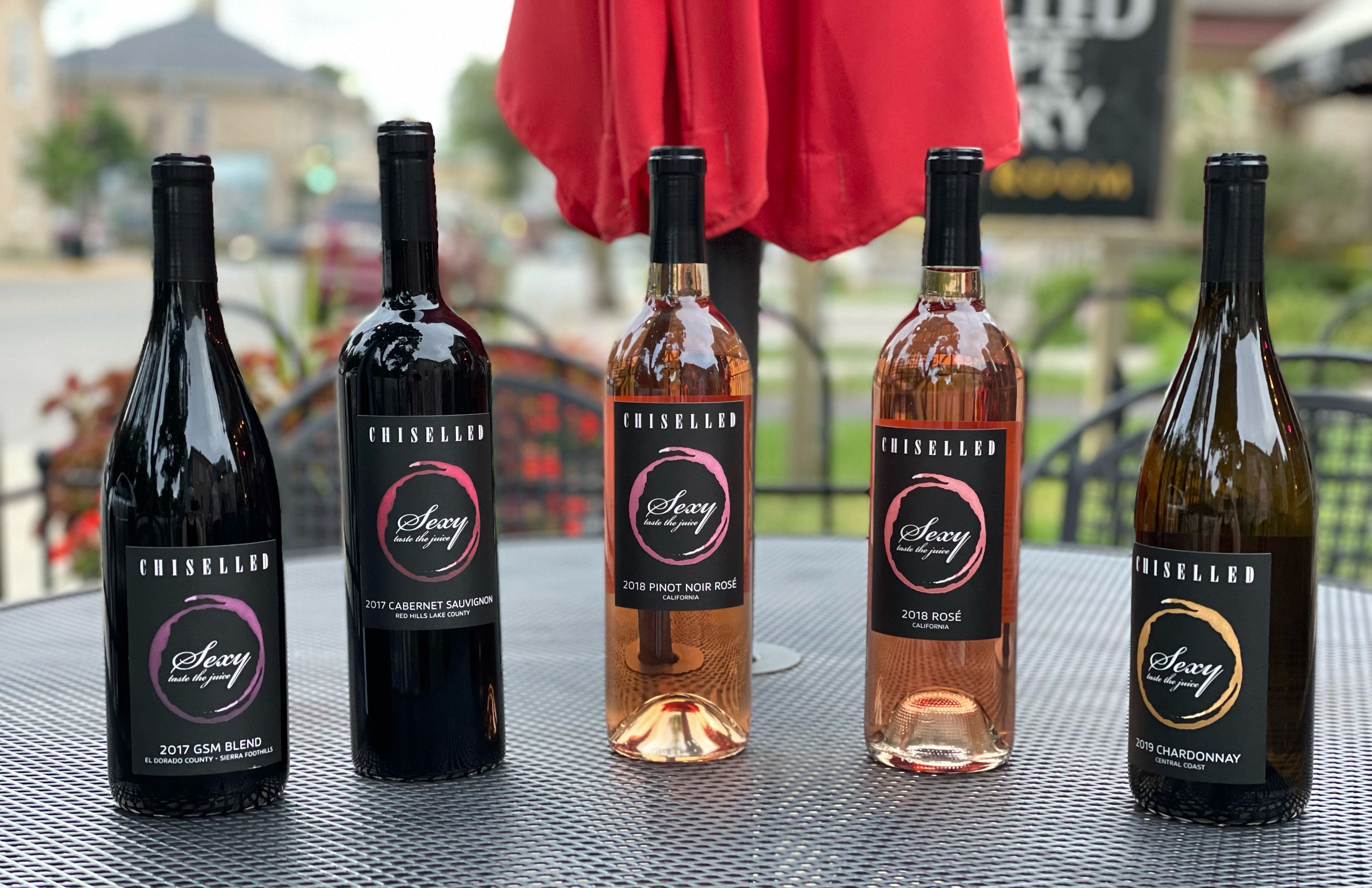
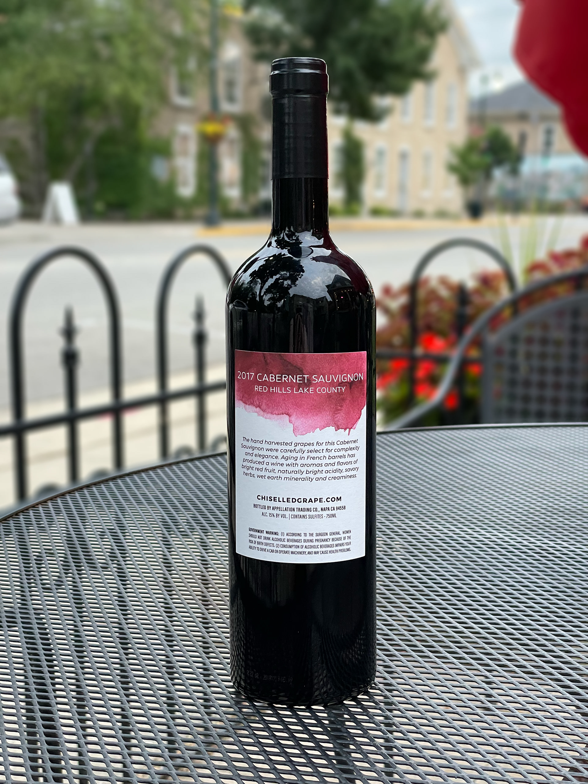
My role was to create a flexible packaging system that established a strong visual identity for the Sexy line of wines while allowing for easy adaptation across future varietals. I worked with the California-based wine producer to ensure all practical requirements were met, including summarizing appropriate romance copy and adhering to industry and FDA regulations.
Approach
I began with a word association exercise to define the visual language of the Sexy brand, identifying key attributes such as mysterious, bold, and refined. From there, I explored ways to create a flexible design system that could be adapted across multiple varietals.
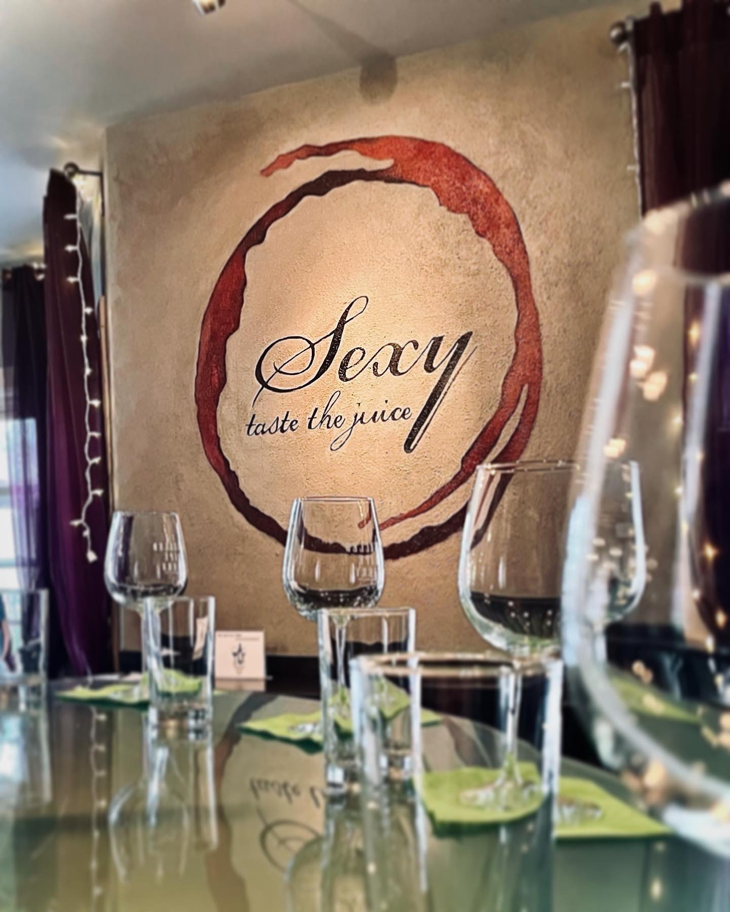
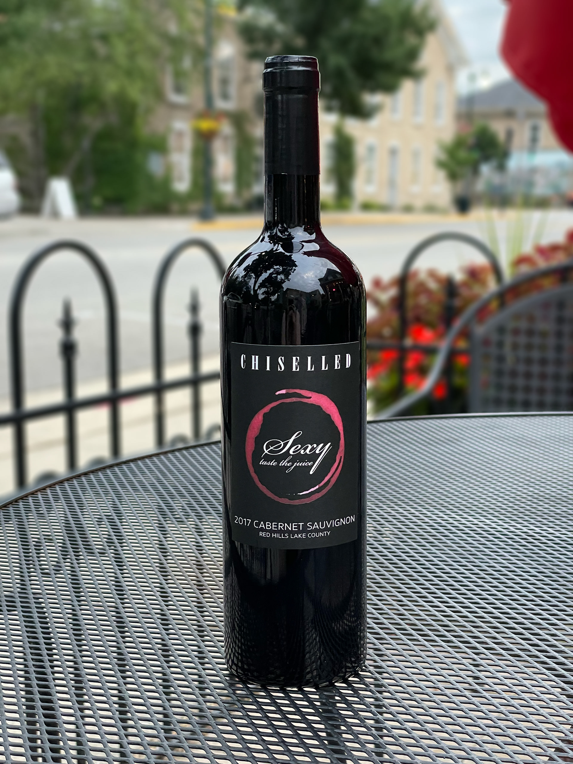
The final concept centered on the brand name encircled in a wine stain — a distinctive feature that could be color-coded based on the varietal without disrupting the product line cohesion.
Result
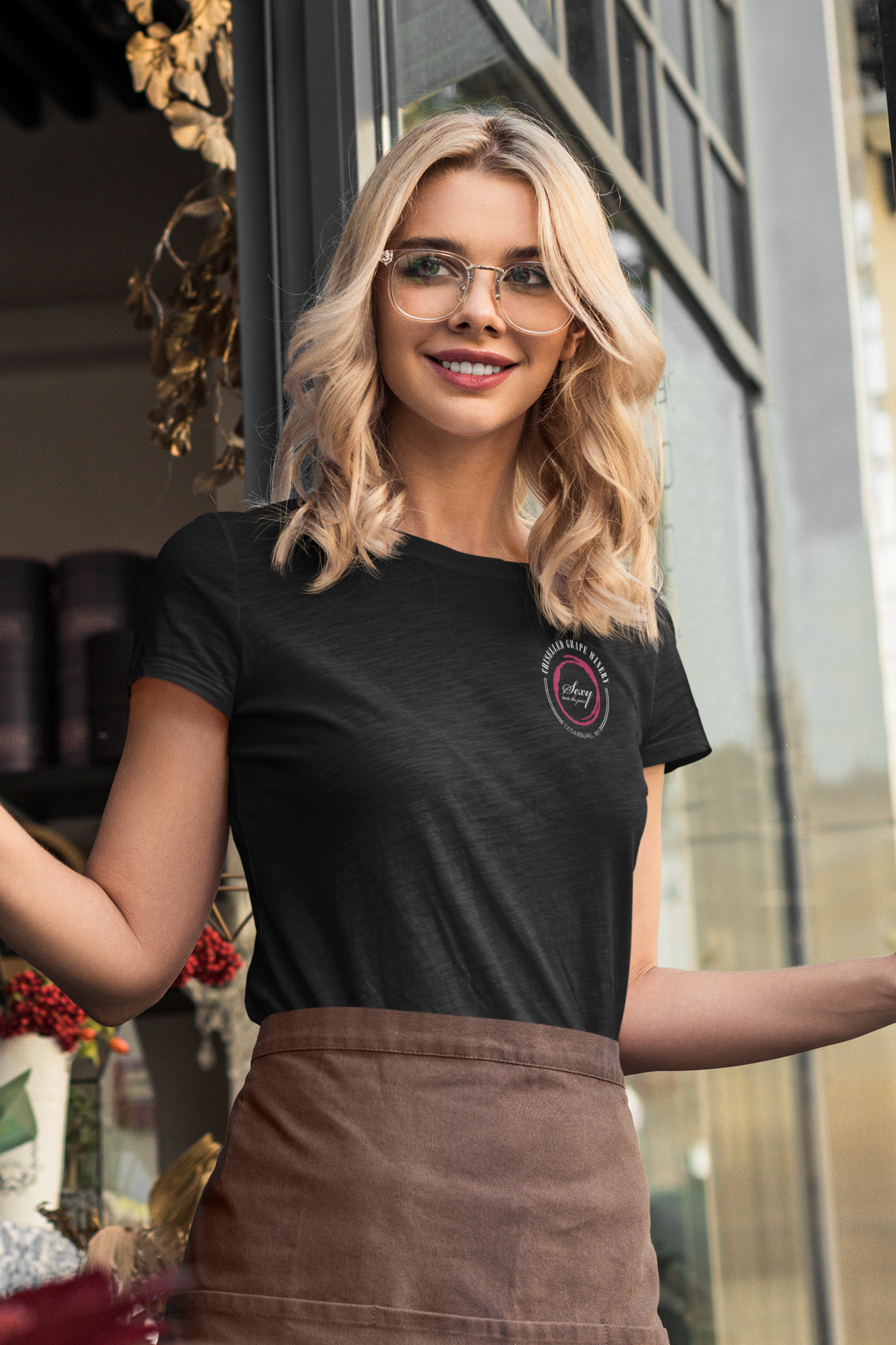
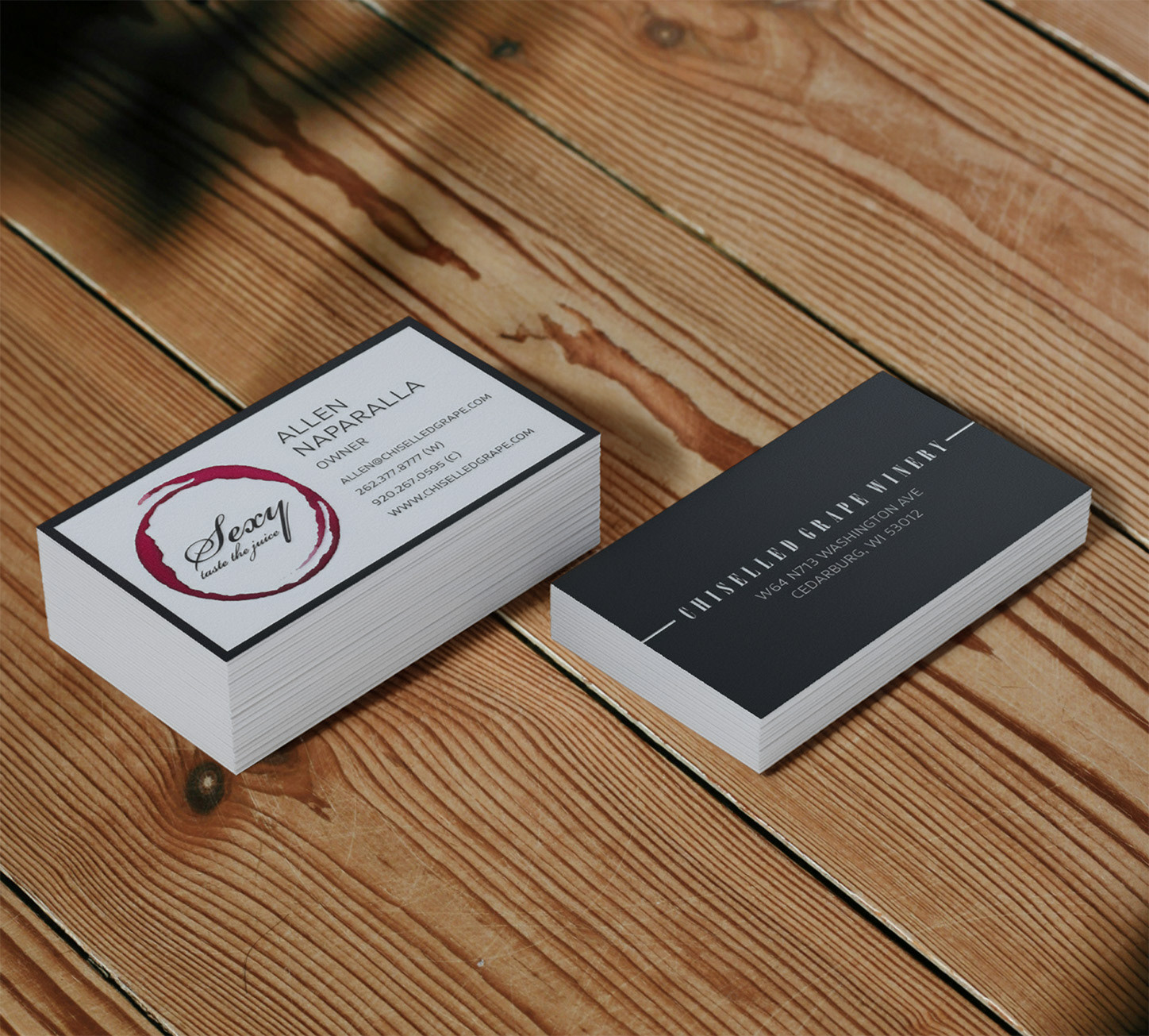
Following the rollout of the new labels, the client reported a noticeable increase in sales and was able to successfully raise the price per bottle. The redesign elevated the product’s perceived value so significantly that it ultimately became the primary visual identity for Chiselled Grape, overtaking the original logo as the winery's main identifier.
Additional Applications