Invitation Design Brief
Year: 2025 Under Employment: Freelance Deliverables: Invitation Kit
Challenge
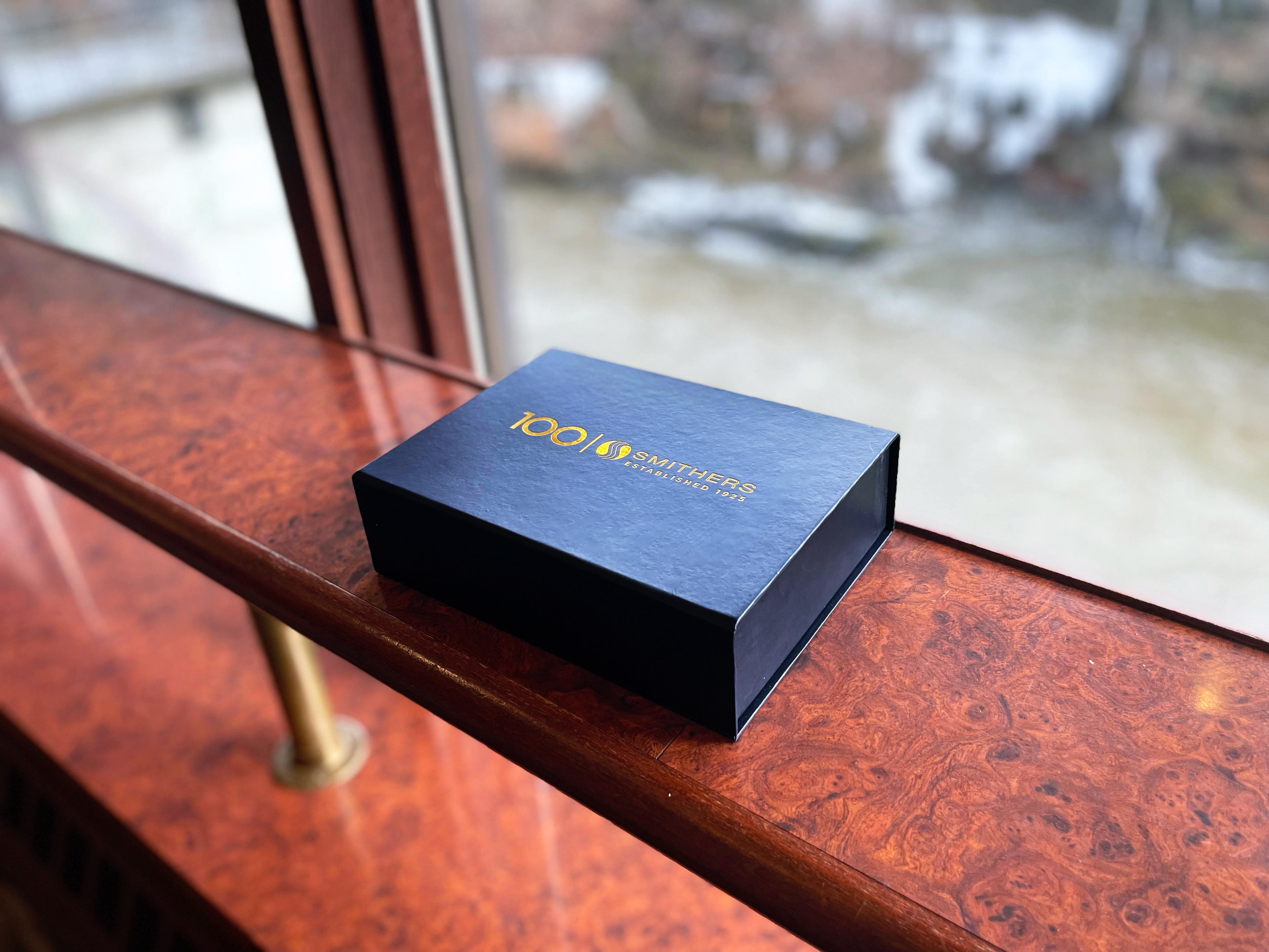
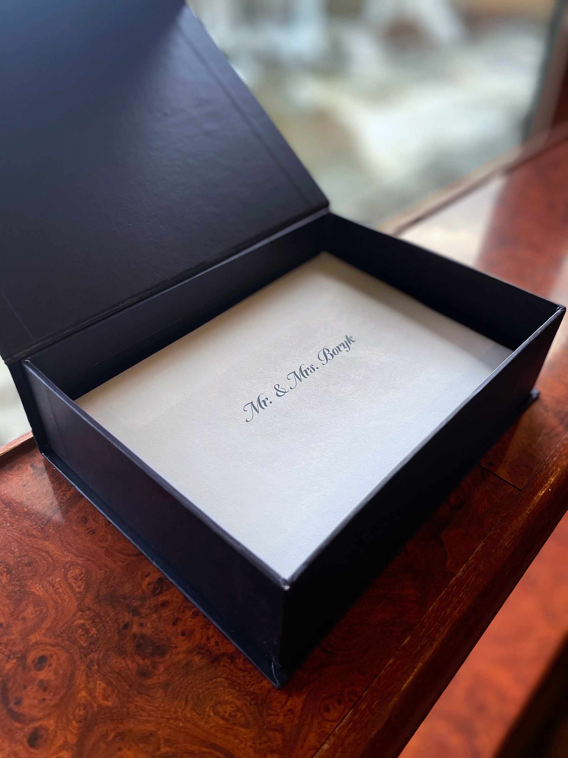
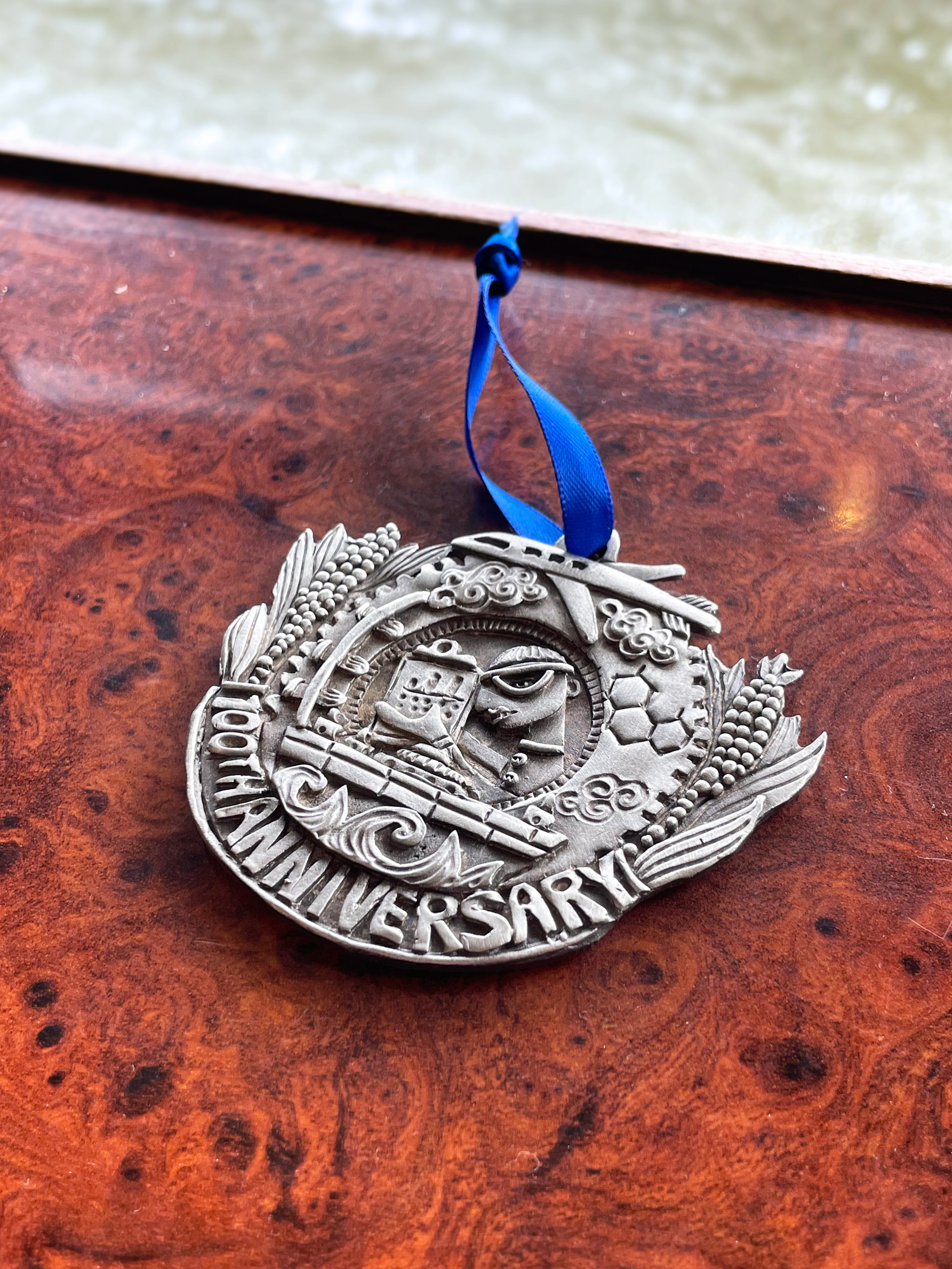
Smithers expressed an interest in sending premium gift boxes to top-level leadership and key clients—approximately 60 recipients—as an invitation to the Smithers 100 Year Anniversary corporate luncheon.
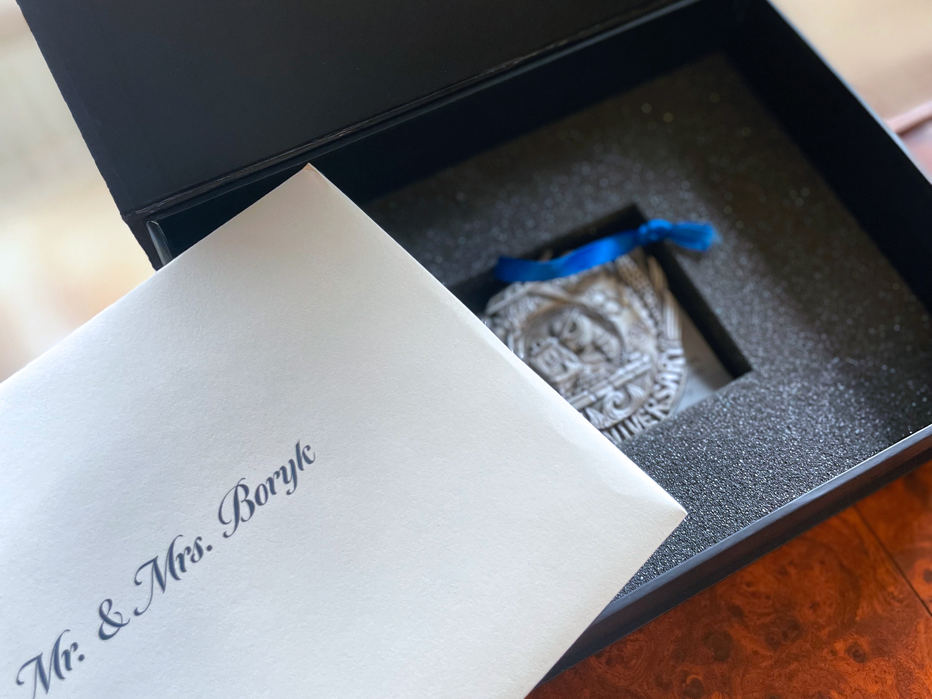
The gift should feel unique to Smithers and its history and special enough that recipients will want to keep it, and be packaged in a way that fits neatly alongside the formal invitation.
Additionally, they want the invitations to convey a high-end experience without disproportionately increasing costs for only a small subset of invitees.
my role
Working with Smithers’ Marketing leadership, I helped explore meaningful gift concepts and recommend options that aligned with their budget. I also advised on packaging and invitation materials and coordinated cost estimates from multiple vendors.
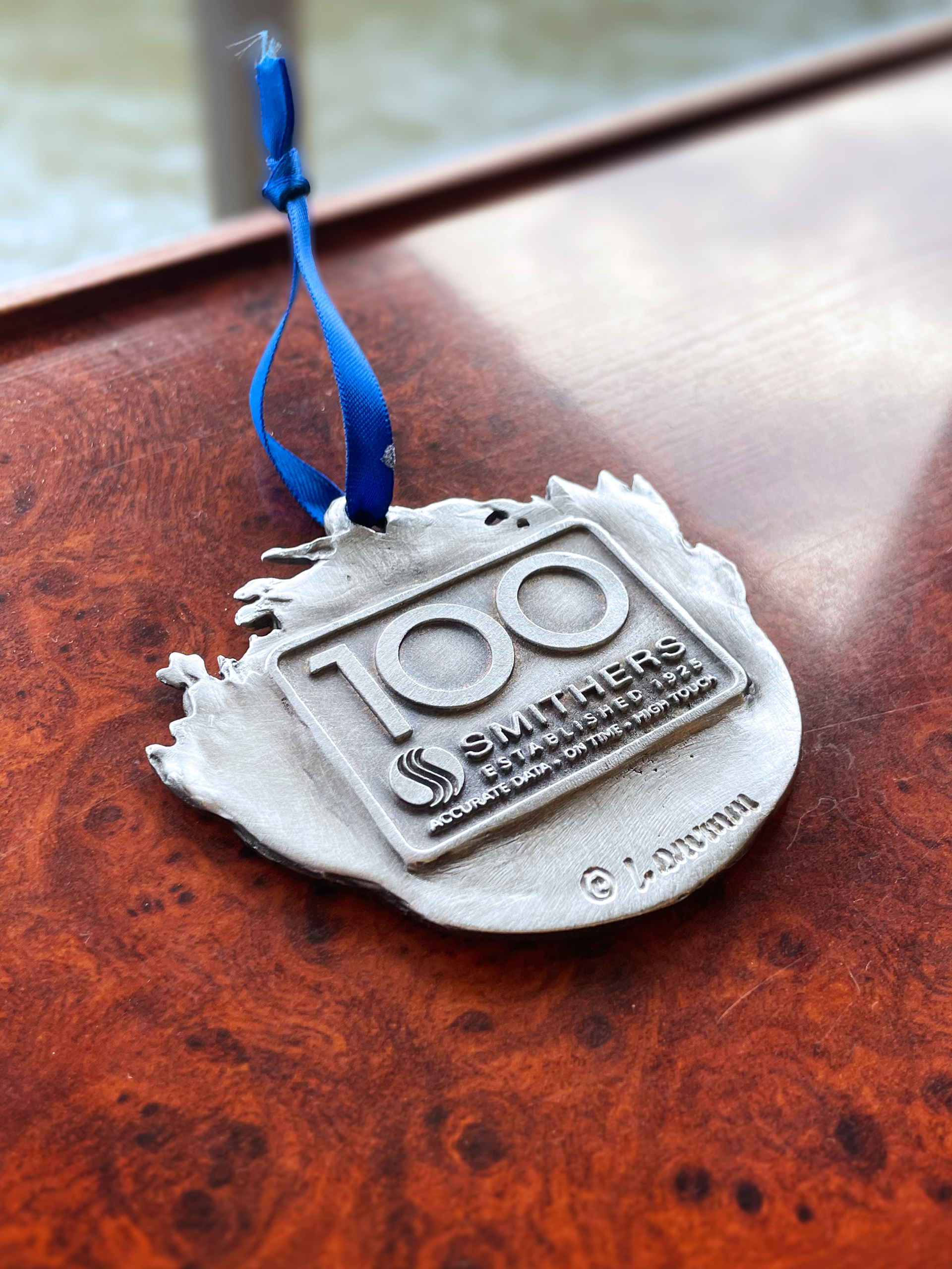
Ultimately, we selected a custom metal ornament crafted by Don Drumm Studios. I was involved in guiding the initial creative direction, provided iterative feedback to the artist, Leandra Drumm, and supplied the digital assets needed for the stamped logo on the reverse side of the ornament.
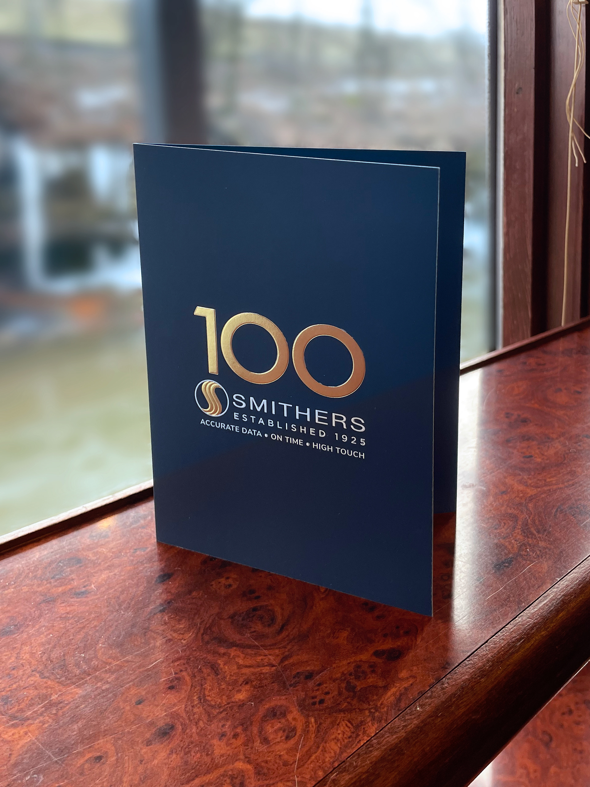
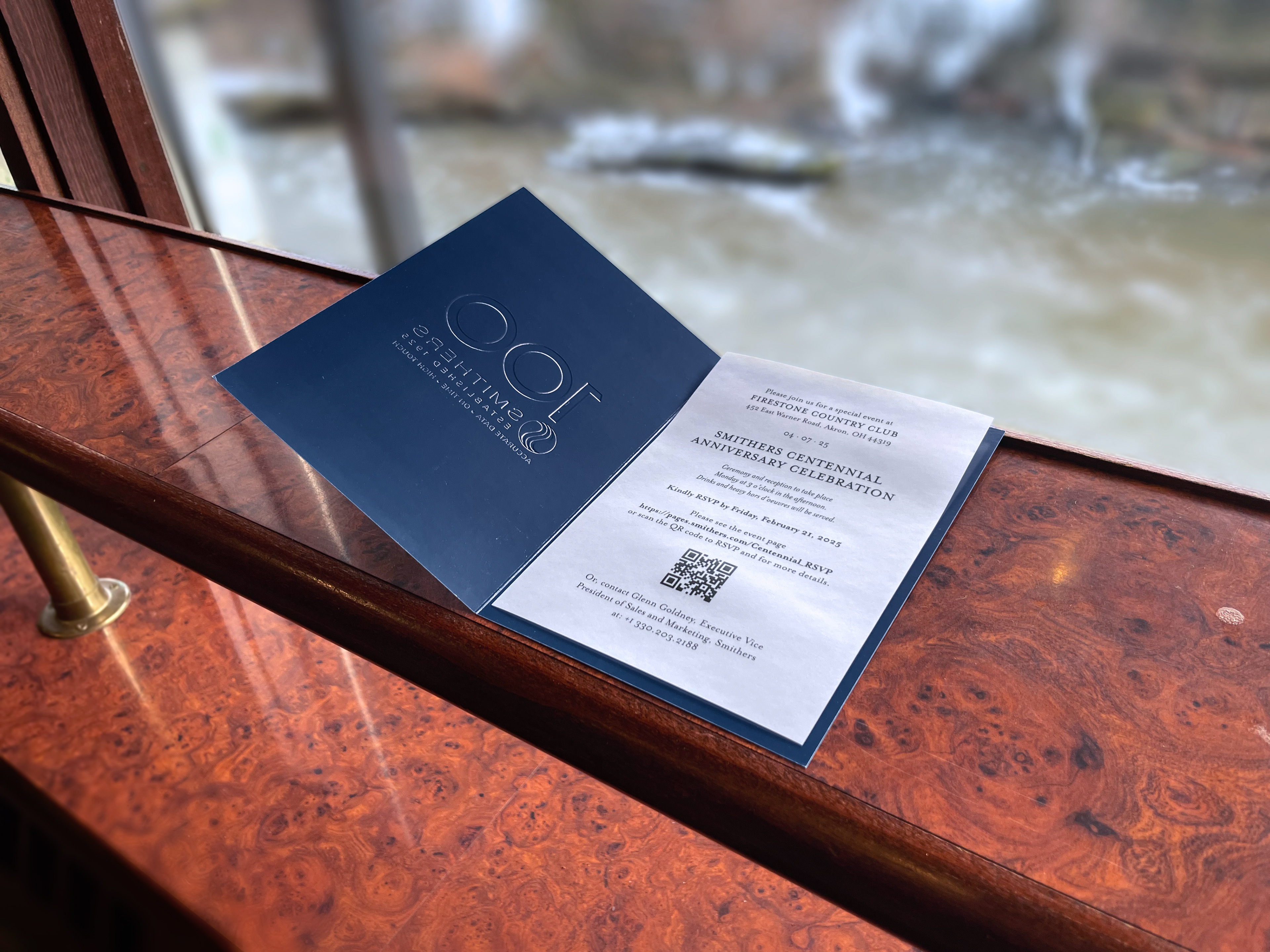
In addition, I designed and prepared the production-ready artwork for the invitation suite, including the printed invitation, envelopes, gift boxes, and shipping labels.
Approach
I began by reviewing the materials developed by the New York design firm and meeting with the Smithers team to identify which elements should be retained and which needed refinement. Through these discussions, we uncovered several core issues:
The core color palette was too limited, and the extended palette lacked cohesion.
I removed the clashing accent colors (including aqua, coffee brown, army green, and wine red) and replaced them with additional shades of blue to create a more cohesive system.
I removed the clashing accent colors (including aqua, coffee brown, army green, and wine red) and replaced them with additional shades of blue to create a more cohesive system.
The "wave" graphic was applied inconsistently and was difficult to use.
I redesigned the wave into a more versatile element, providing layout variations and clear application guidelines.
I redesigned the wave into a more versatile element, providing layout variations and clear application guidelines.
The existing templates were rigid and could not accommodate different types or volumes of content.
I rebuilt the templates as a flexible, grid-based system with standardized headers, footers, and rules for typography and color-block usage.
I rebuilt the templates as a flexible, grid-based system with standardized headers, footers, and rules for typography and color-block usage.
As the divisions began implementing the refined brand, Smithers recognized the need for formal brand guidelines. Having helped shape the brand over several years, I partnered with Smithers' marketing leadership to develop the structure and write much of the content for a comprehensive brand standards document.
Result
The refined brand system provided Smithers with a flexible, scalable foundation that could be adopted across its many divisions without disrupting ongoing operations.
The implementation strategy allowed for a relatively easy transition for the divisions, pushing brand consistency while protecting prior investments.
The resulting brand guidelines, first published in 2023, established a single source of truth, giving internal teams and external partners the tools to produce cohesive, on-brand communications across the organization.