Branding Brief
Year: 2020 Under Employment: 427 Design Deliverables: Logo, Basic Brand Guidelines, Website, Photography, Merchandise, Interior Building Graphics + Wayfinding

Challenge
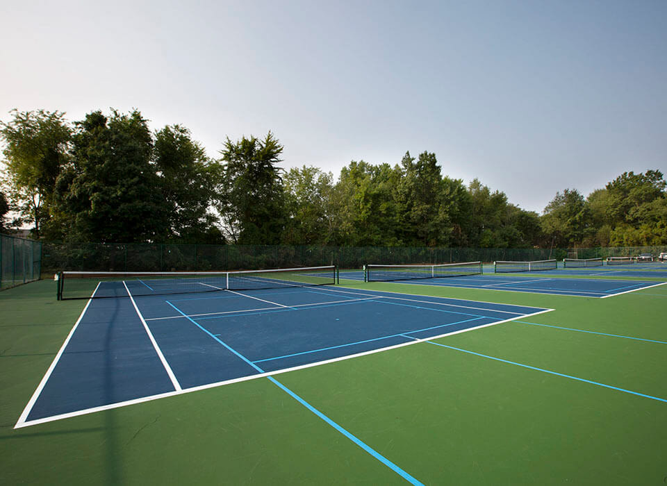
Springside Athletic Club required a complete ground-up rebrand, with only the name remaining unchanged. As one of the most comprehensive fitness and sports facilities in the region, Springside offers a wide range of amenities, including indoor and outdoor tennis courts, pickleball, basketball courts, a fieldhouse, indoor track, weightlifting and cardio equipment, steam rooms, massage services, a pro shop, childcare, and an on-site café.
However, the club’s logo and branded materials had not been updated since the 1990s. The dated visual identity no longer reflected the premium experience Springside provides, nor did it effectively attract new members in an increasingly competitive fitness market.
My Role
I served as the primary designer and junior art director on this project, overseeing all production artwork, final graphic approvals, merchandise sourcing, and vendor coordination.
As a solo contributor, I developed the logo, brand guidelines, website design, building graphics, and wayfinding system. I also contributed as a photographer as part of a three-person photography team, and was solely responsible for all photo editing and post-production.
Approach
As this was a large, multi-faceted project, a solid understanding of goals and alignment with the client was crucial. Springside wanted to position themselves as an established athletic club with premium facilities that is open to all ages and fitness levels. Their primary description on how they wanted the branding to look was "vintage but modern."
Based on research and discovery, a relatively simple brand identity with very clear cohesion seemed the best way to achieve this.
result
Springside Athletic successfully launched their updated branding in 2021, and has continued to grow ever since — increasing membership, adding new classes, and revitalizing their space and equipment.
Project Details
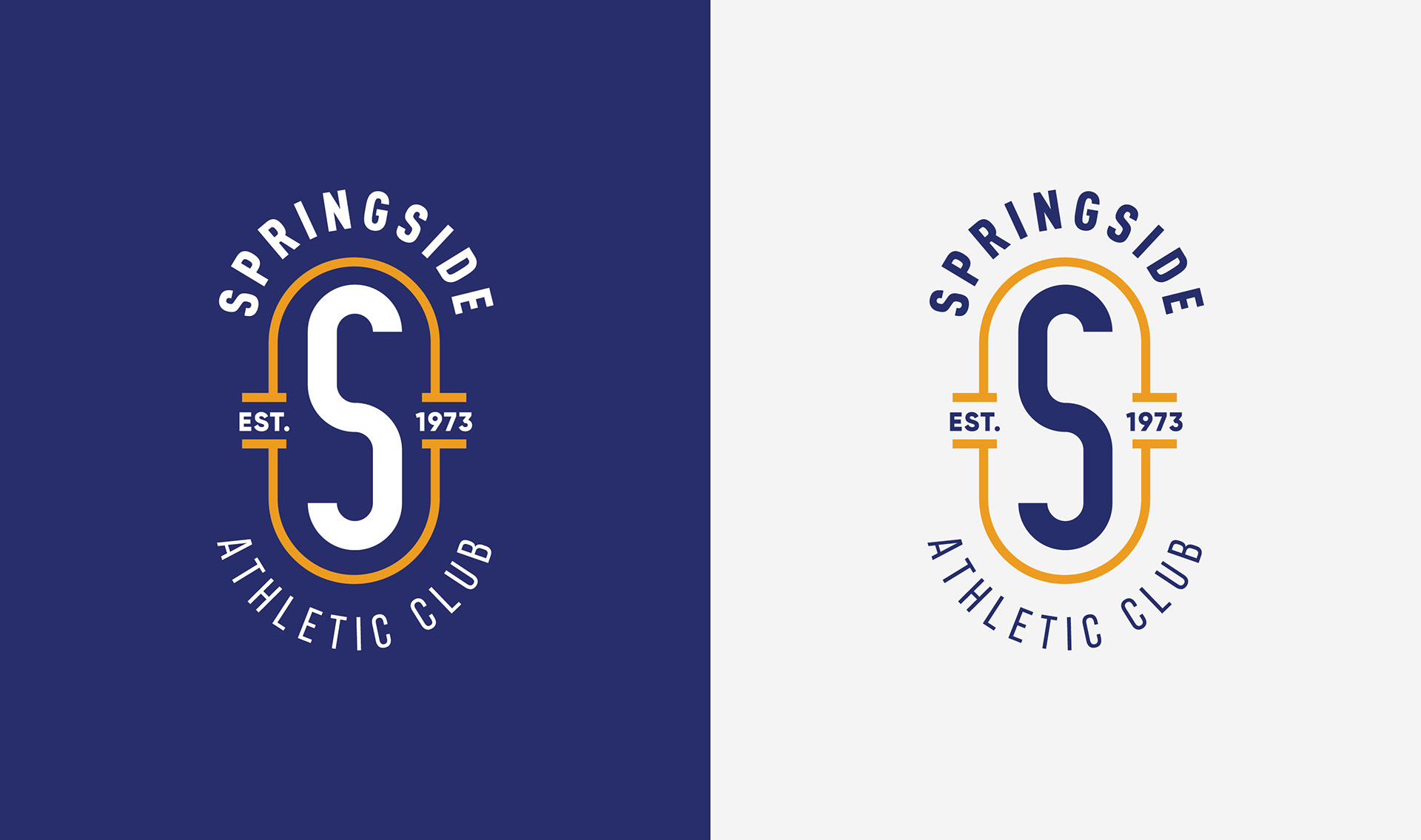
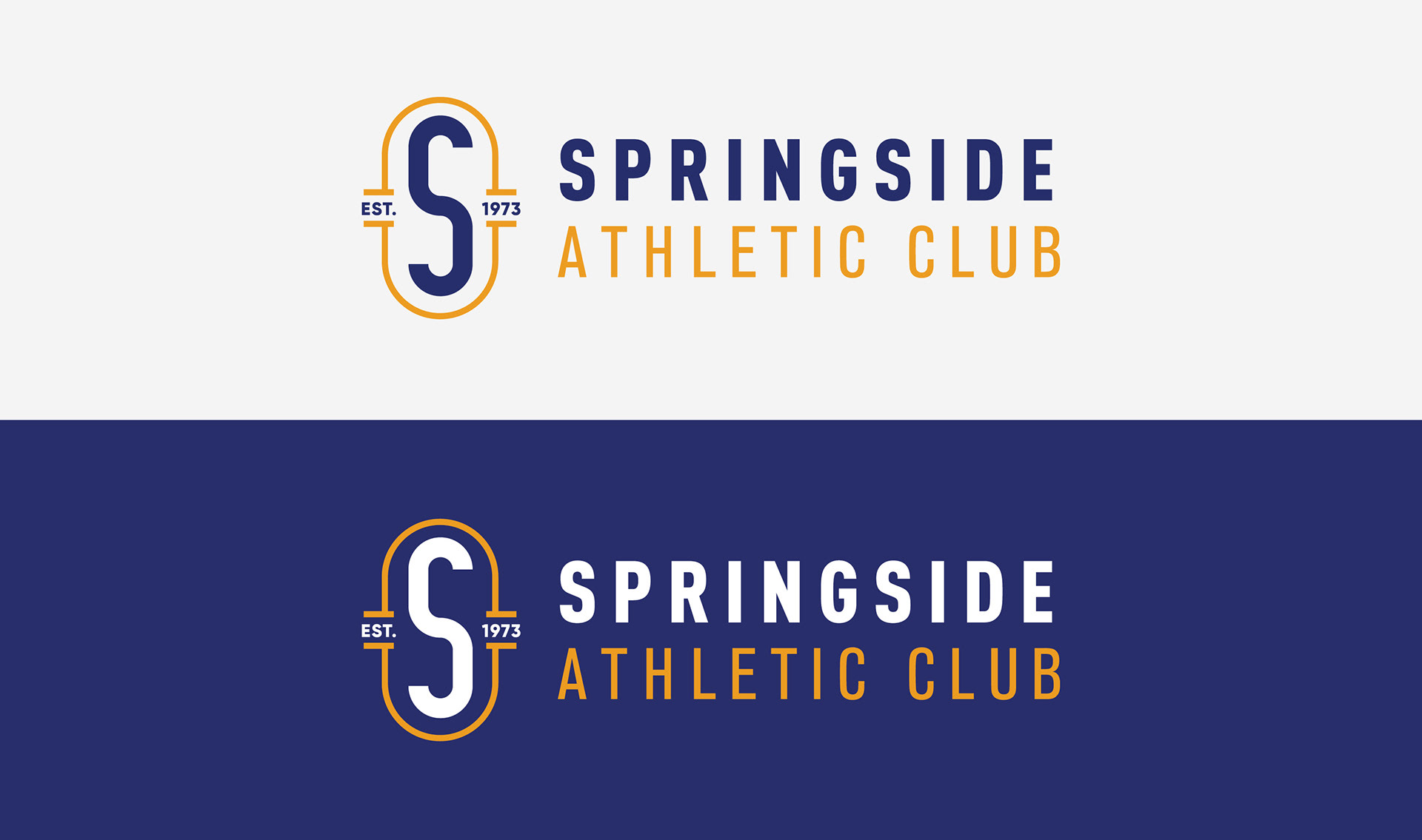
Logo
The team at Springside Athletic Club wanted a logo that felt both vintage and modern. Springside was presented with a number of options, including collegiate-looking emblems, country club crests, and even a re-imagined version of their original 1970's logo. They opted for a simple oval emblem with vibrant, contrasting colors.
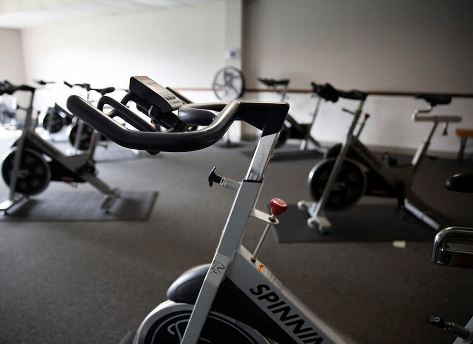
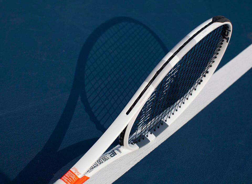
Photography
Springside required photography to use on the website and promotional materials. While I was tasked with all final editing, two other photographers joined me for the on-site shoot.


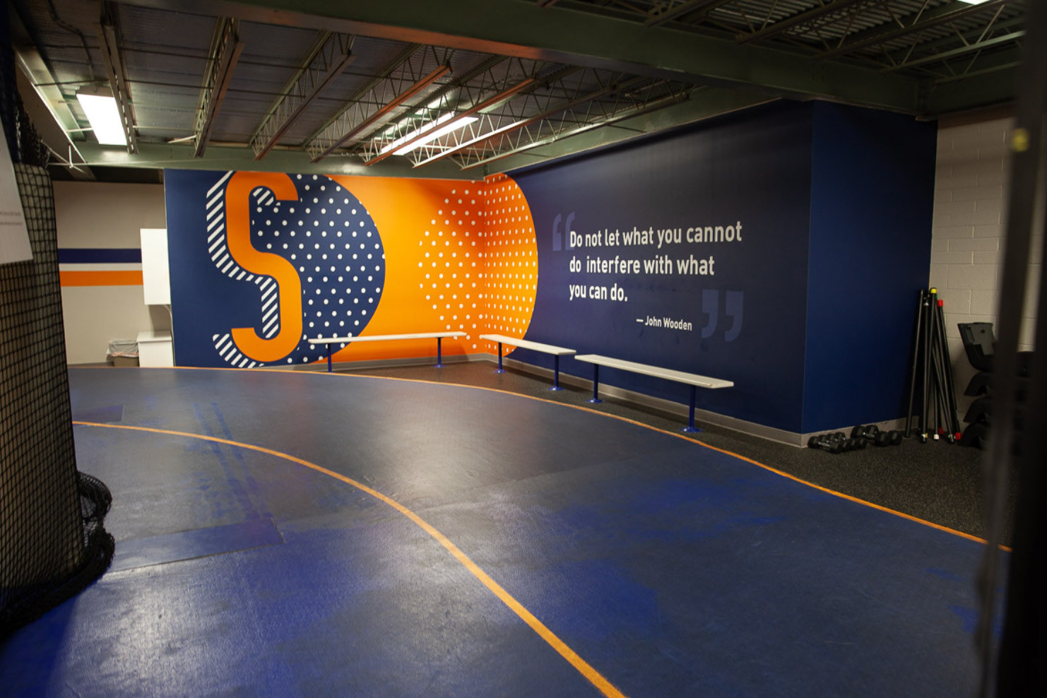
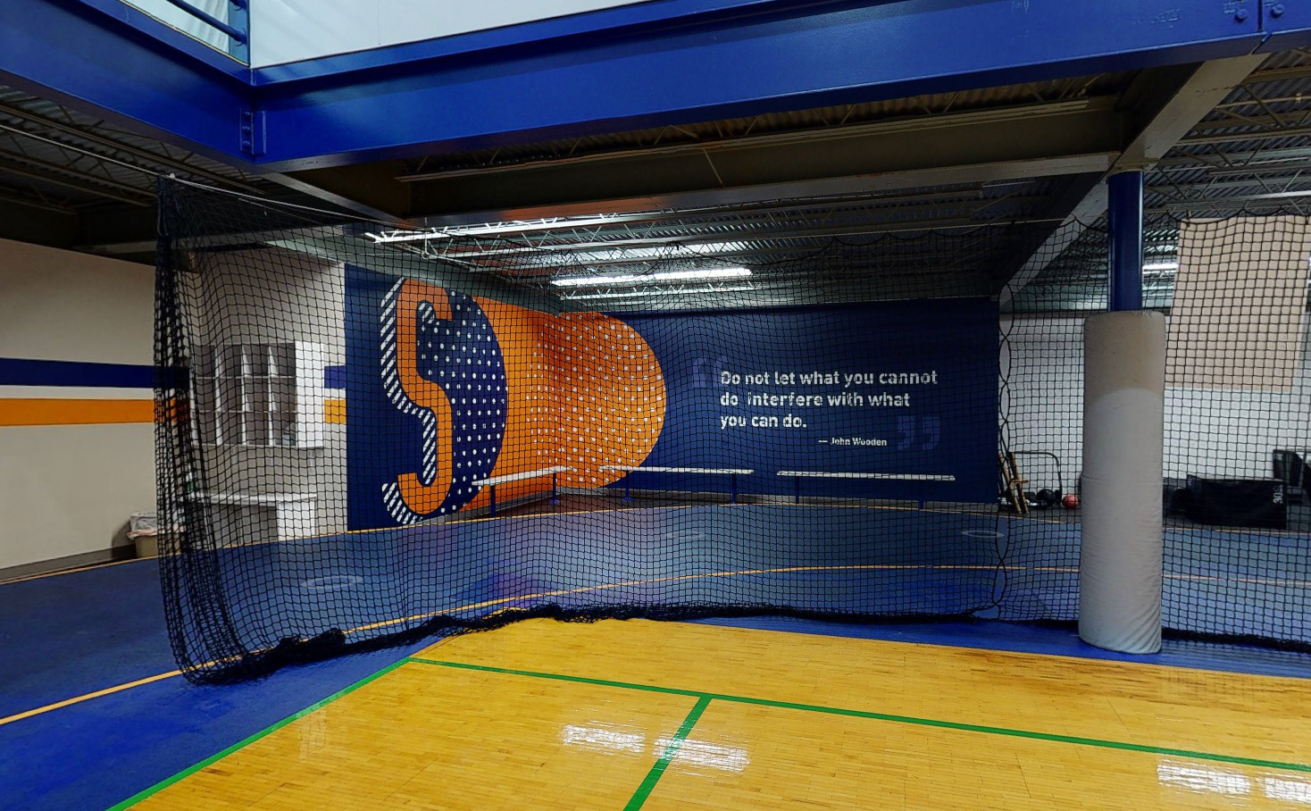
Facility Graphics + Wayfinding
Springside Athletic Club has many exercise areas, including a running track, cardio room, field house, and tennis courts. They requested signage for both wayfinding and decoration, and also took recommendations on painting walls, support beams, and even the track itself to complete the branded look.
Xd Website Mockup (Interactive)
Springside did not have a website at the beginning of this project. Below is an Adobe Xd concept. Some areas were removed or reworked to accommodate the coding budget (such as the trainer slider), but much of the art translated to the final site.
Springside's current site has been rebuilt on a new platform, and is no longer a reflection of my interface design.
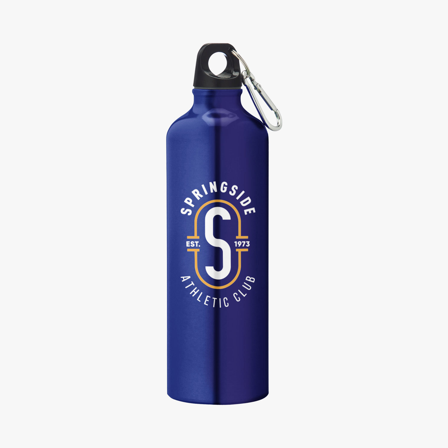
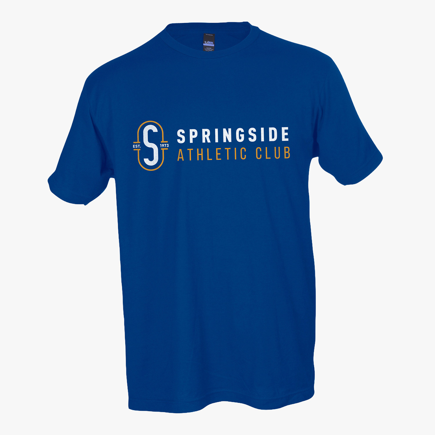
Merchandise
Springside requested a few items to sell in its pro shop. I handled the search and selection of items, preparing artwork, and approving proofs and samples.


Contributions shown above are entirely my own, unless otherwise noted.