Logo Brief 1.0
Year: 2020 Under Employment: 427 Design Deliverables: Logo Kit
Challenge
Project School Nutrition needed a logo that spoke to the company's directive and also personally represented CEO Ashely Morena, as Project School Nutrition was (at the time of development) a one-woman team. My team was asked to develop a feminine logo, preferably including the color pink.
my role
For this project, I worked as part of a design team. Our team followed a process of “competitive collaboration,” beginning with group alignment sessions before splitting off to independently develop concepts. We then reconvened for internal critique and feedback, eliminating concepts that overlapped too closely and refining the strongest directions through a team vote. The selected concepts were presented to the client, and the designer whose concept was chosen led the final refinement and delivery of the completed assets.
Approach
I developed logos with focuses on education, health, and sustainability. PSN is an educational service provided to schools focusing on nutrition, often proposing innovative budget solutions such as community gardens.
Result
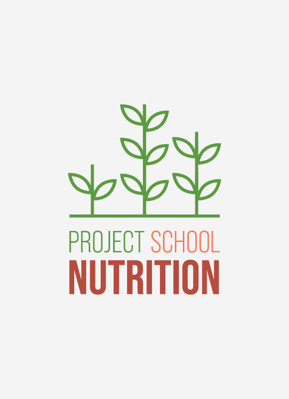
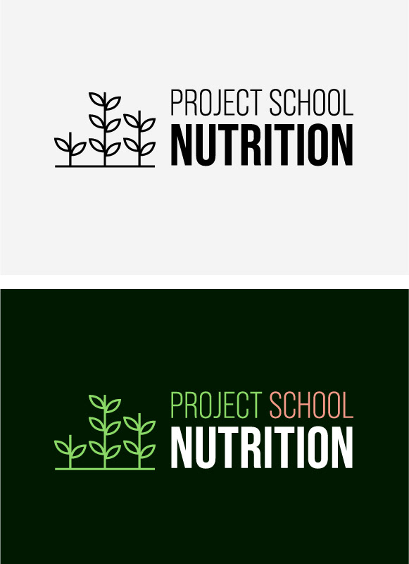
The client opted for one of my logo concepts: three sprouts growing up from the ground, blooming into cutlery (a fork, spoon, and knife). The client requested that we remove the cutlery "blooms" from the sprouts and vary the sprout height.
Overall feedback was positive; the client said that the logo look and feel represented her well, and projected friendliness without coming off as Kindergarten-esque.
Brand Brief 2.0
Year: 2022 Under Employment: Freelance Deliverables: Logo Kit, Basic Brand Guidelines
Challenge
By 2022, the company had grown into an established, multi-person team. PSN felt that the original logo reflected CEO Ashley Morena’s personal brand more closely than the company itself, and reached out to me to explore a rebrand that was bold, gender-neutral, and would clearly differentiate PSN from its competitors.
my role
I took this on as a freelance project, and therefore was responsible for discovery, research, strategy, ideation, and final deliverables. I was also responsible for developing supporting decorative elements and compiling basic visual brand guidelines following the final selection of the logo.
Approach
An exploration of competitor brands revealed a strong reliance on logos featuring apples, carrots, and spoons, with bright green commonly paired alongside red or orange. My approach was to reference familiar industry cues while presenting them in a more unexpected way — incorporating a less conventional fruit, a differentiated color palette, etc.
The concepts were also developed with future brand expansion in mind, considering how the identity could extend into patterns, iconography, merchandise, and other supporting brand applications.
The Result
Unfortunately, the client did not like any of the proposed concepts.
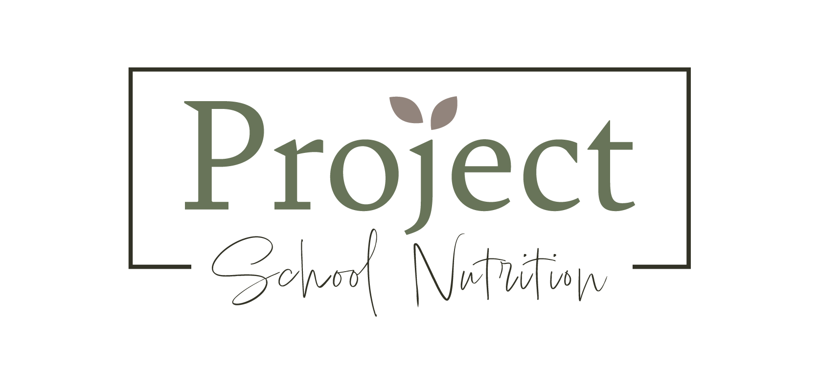
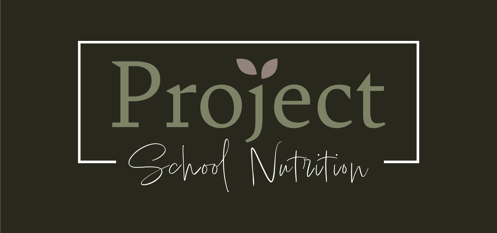
They requested that the new logo be modeled after a graphic that CEO Ashley Morena liked: a green and mauve script logo contained in a box. This was developed and given final approval.
Two months post-launch, PSN reverted back to their original logo on the basis that it resonated more strongly with their clientele.
Proposed Concepts